
Brand identity Case study: MTH
Brand Identity, Digital Product design
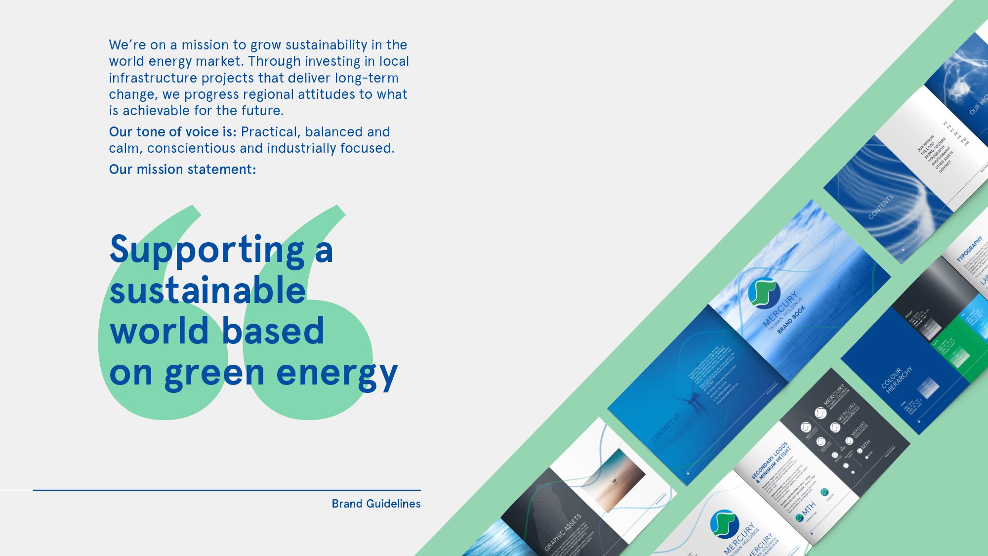
How do you create a cross-cultural brand identity for an off-shore wind farm project that doesn't exist yet? Our approach was to combine universal motifs referencing energy waves, sustainability and geographic location (or alternatively 3 parts representing water, land and air), bringing it all together using functional modernist sans-serif typography.
Project deliverables:
Brand strategy & brand architecture
Visual identity guidelines
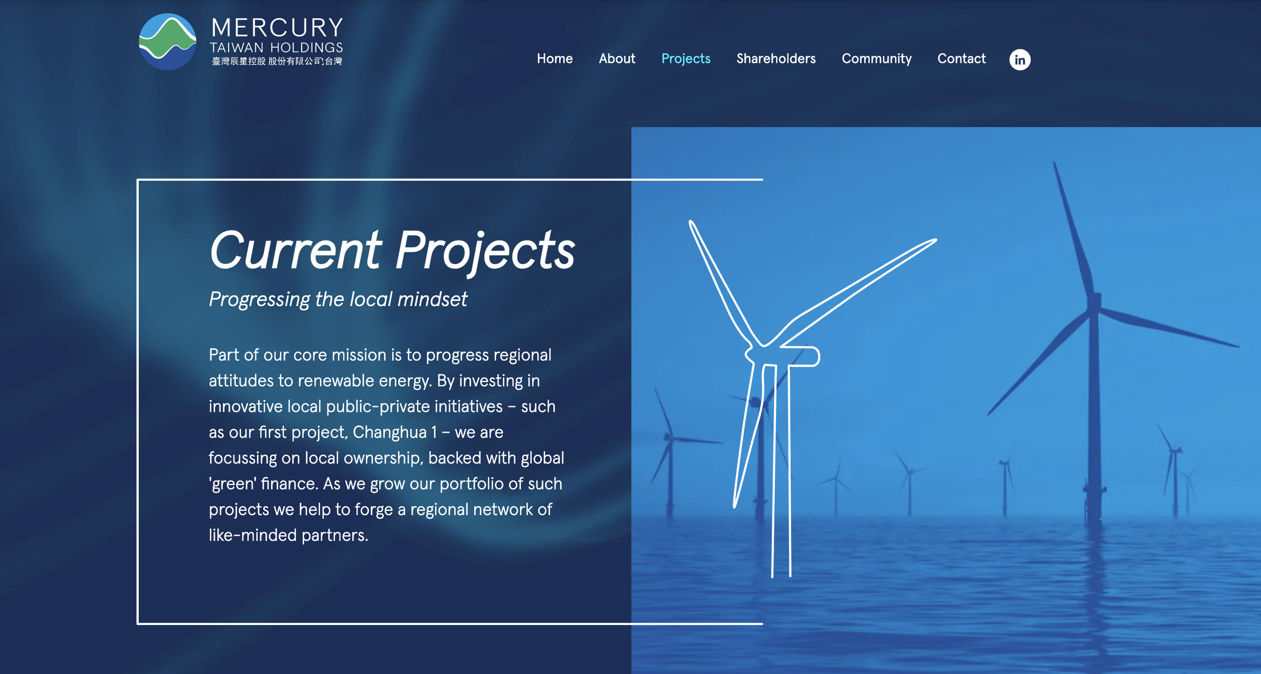
Website
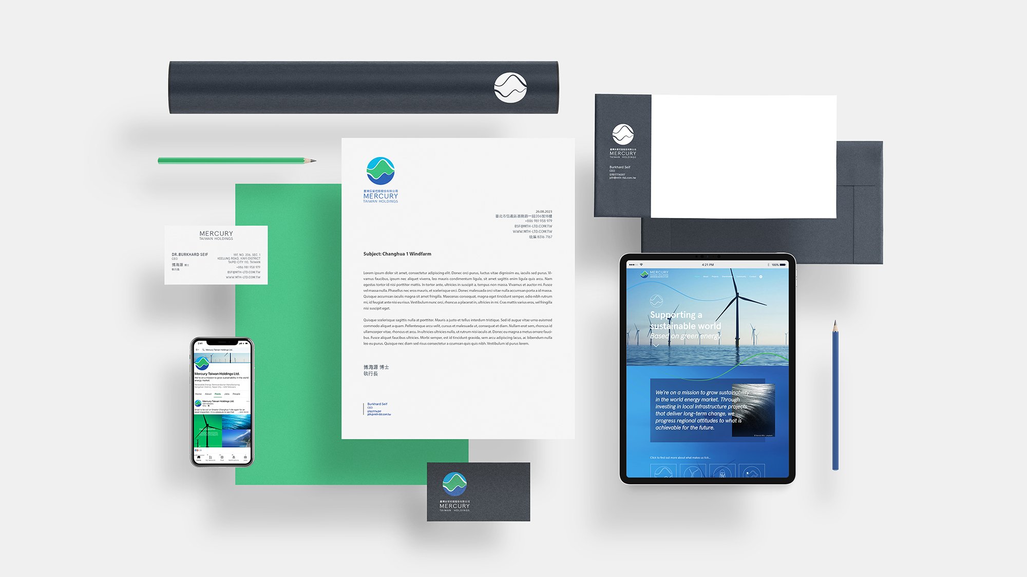
Powerpoint deck & business assets
Social banners & templates
“Jonas nailed our brand strategy, pitching it perfectly for both Chinese and English stakeholders.”

Website

Brand Guidelines

Brand Collateral

Powerpoint Deck
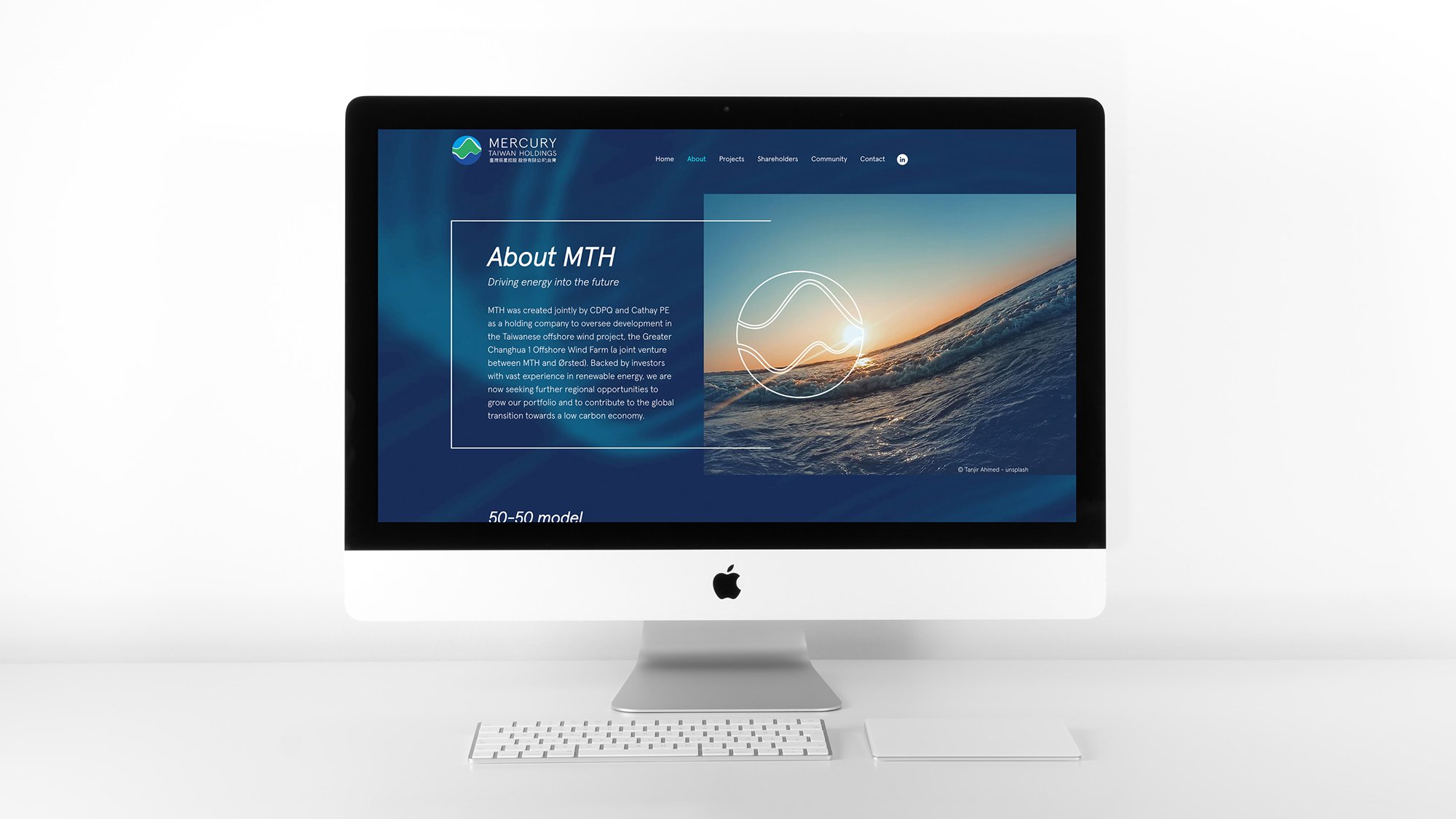

Working closely with MTH and their stakeholders, we developed a design system that fits neatly into a corporate hierarchy (MTH being joint-owned by different entities), whilst maintaining a distinct brand identity with a clear tone of voice and a clear sense of location (the logogram visualising Taiwan).
The end result was a culturally balanced identity, negating the need for an English or Mandarin-first approach. This meant the client could have the flexibility to use a one-size fits all solution across all their marketing communications.


We provided MTH with a full brand kit (guidelines, stationery and social content templates) as well as powerpoint decks and a website.
Mandarin versions are in the pipeline - watch this space!
“Our identity spoke perfectly to our audience - visually engaging and hitting the right tone. The marketing assets provided were easy to use and implement”
Fancy a brand strategy health check? Get in touch…