

Mercury Taiwan
Holdings Ltd
Case Study:
Brand Strategy, Visual Identity & Marketing Design
How do you create a cross-cultural brand identity for an off-shore wind farm project that doesn't exist yet?
Our approach was to combine universal motifs referencing energy waves, sustainability and geographic location (or alternatively 3 parts representing water, land and air), bringing it all together using functional modernist sans-serif typography.
Working closely with MTH and their stakeholders, we developed a design system that fits neatly into a corporate hierarchy (MTH being joint-owned by different entities), whilst maintaining a distinct brand identity with a clear tone of voice and a clear sense of location (the logogram visualising Taiwan).
Project deliverables:
Brand strategy & brand architecture
Visual identity guidelines
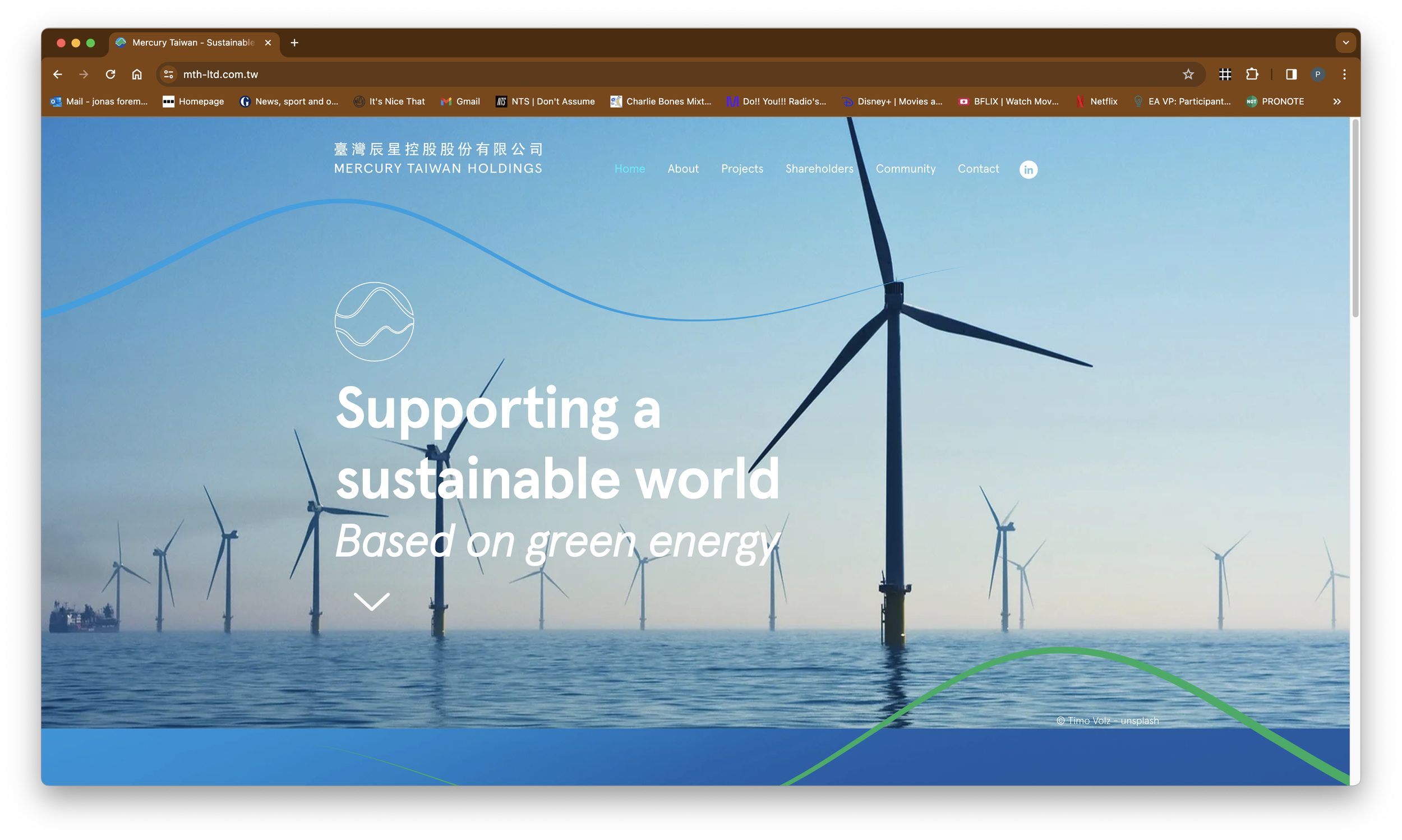
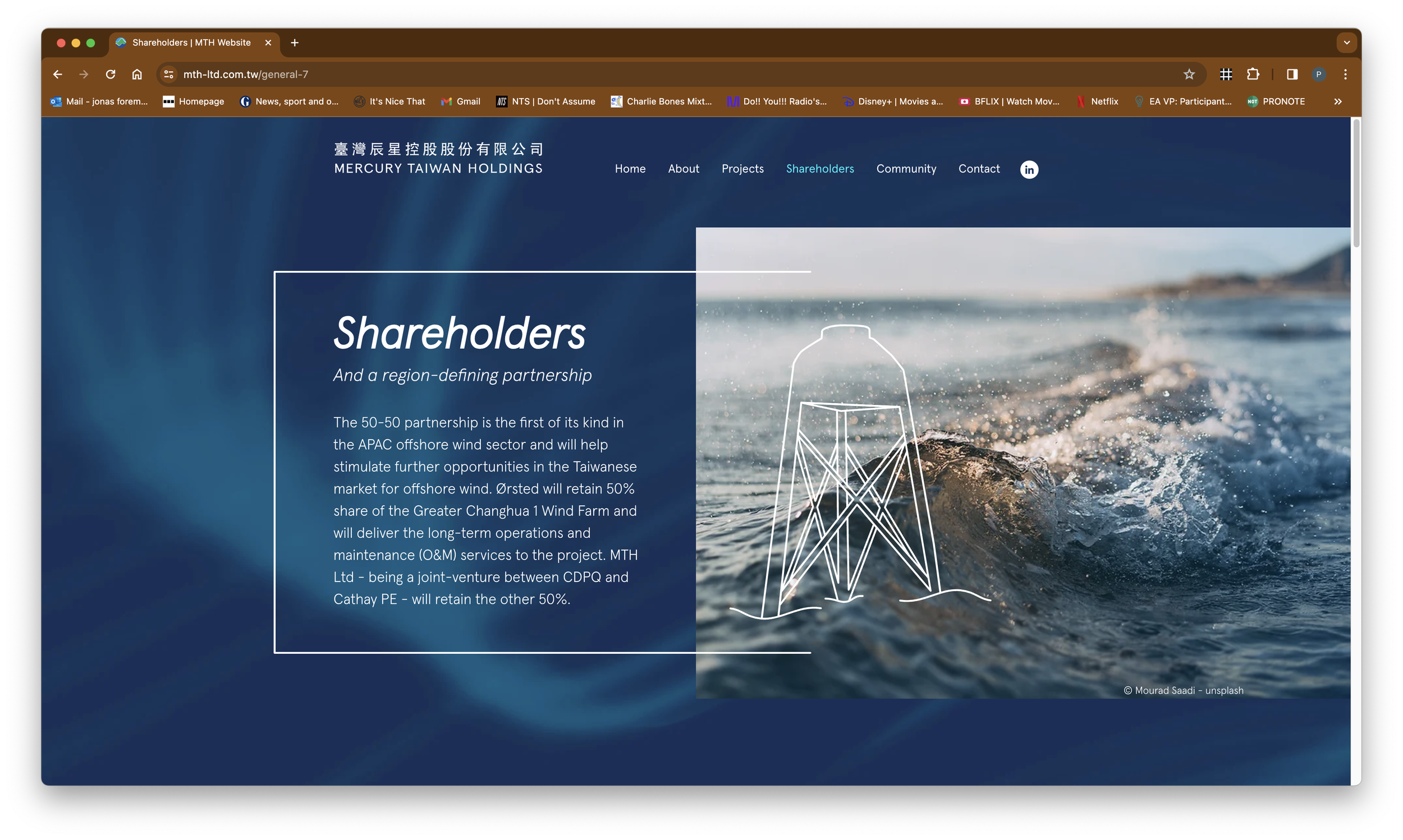
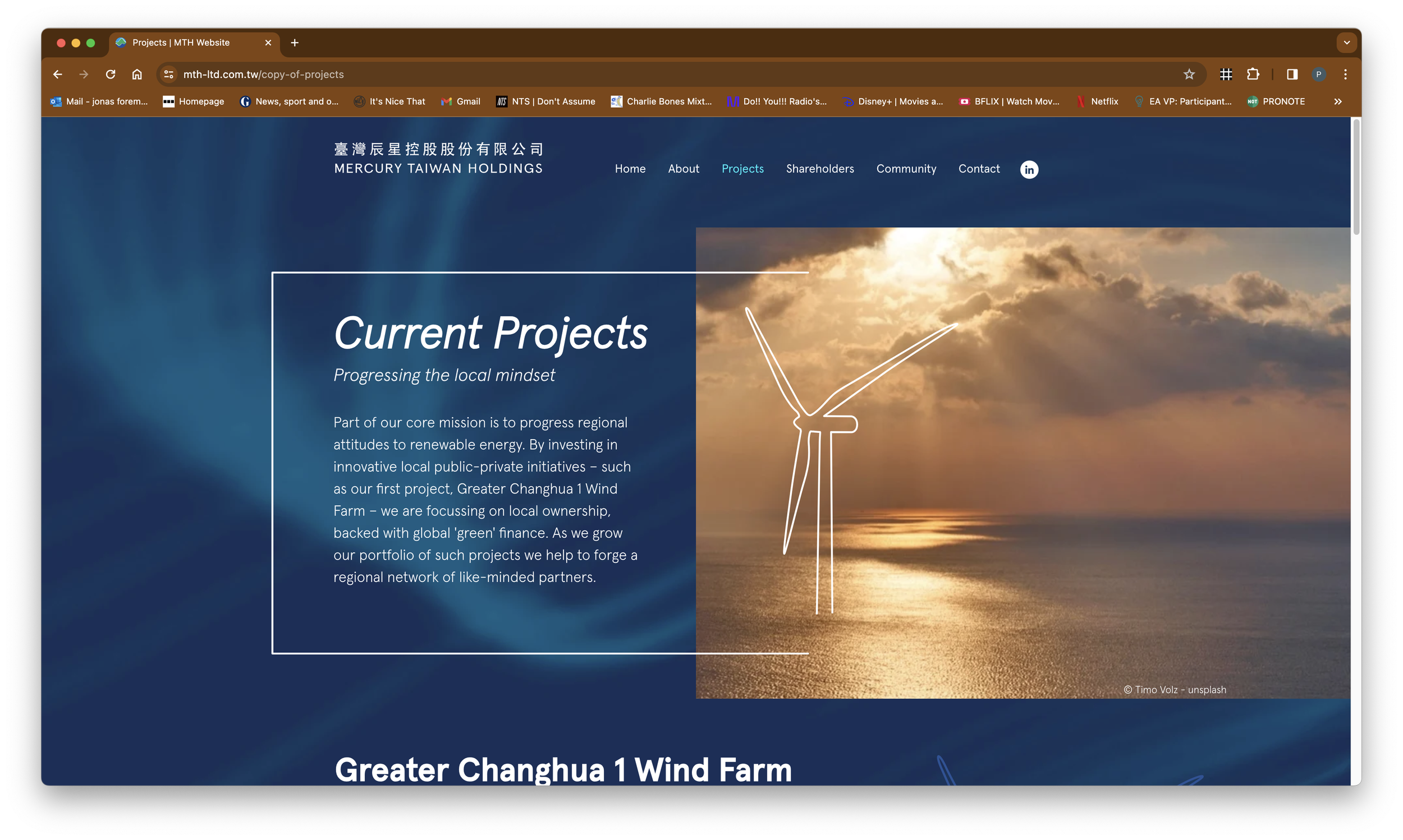
Website
Powerpoint deck & business assets
Social banners & templates
“Jonas nailed our brand strategy, pitching it perfectly for both Chinese and English stakeholders.”

Website
Brand Guidelines

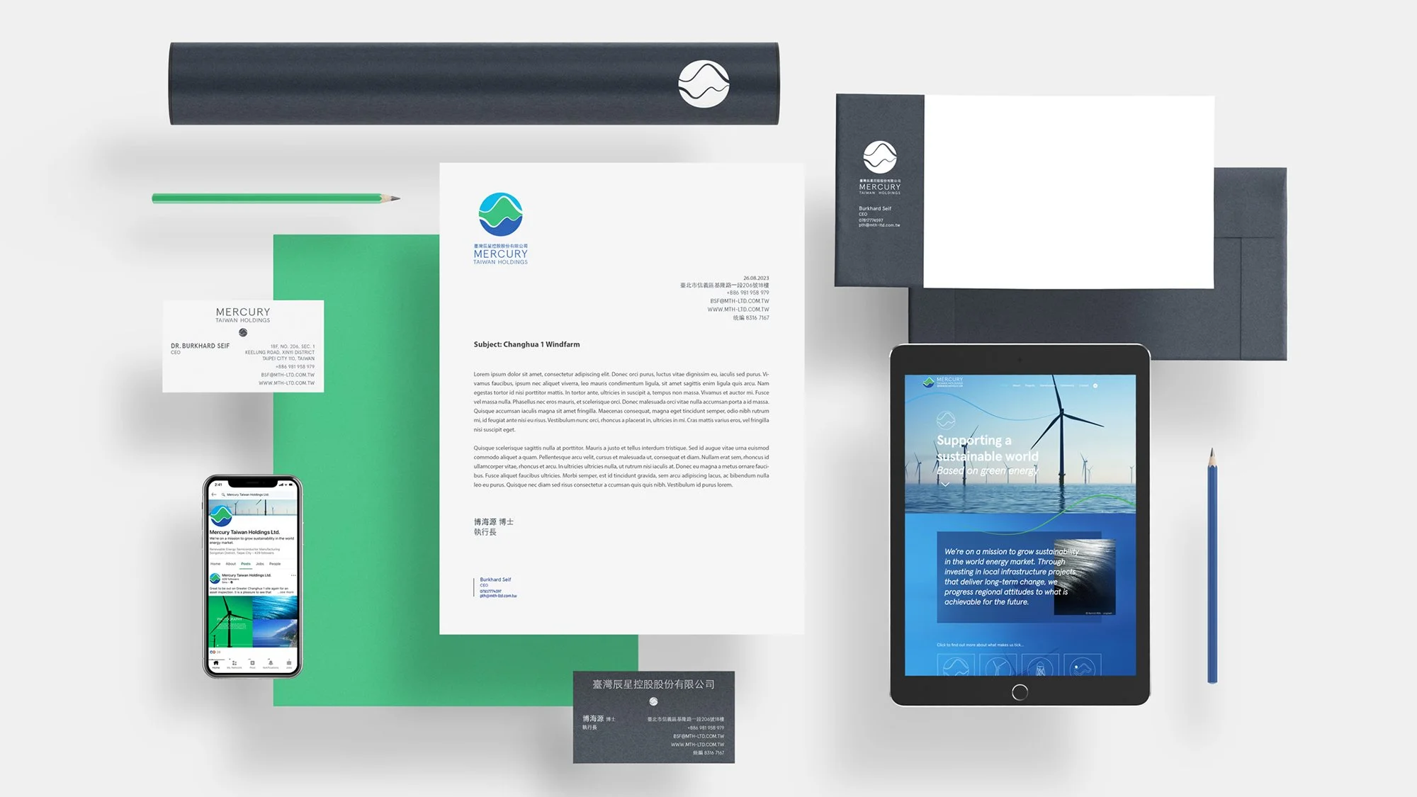
Brand Collateral
Powerpoint Deck
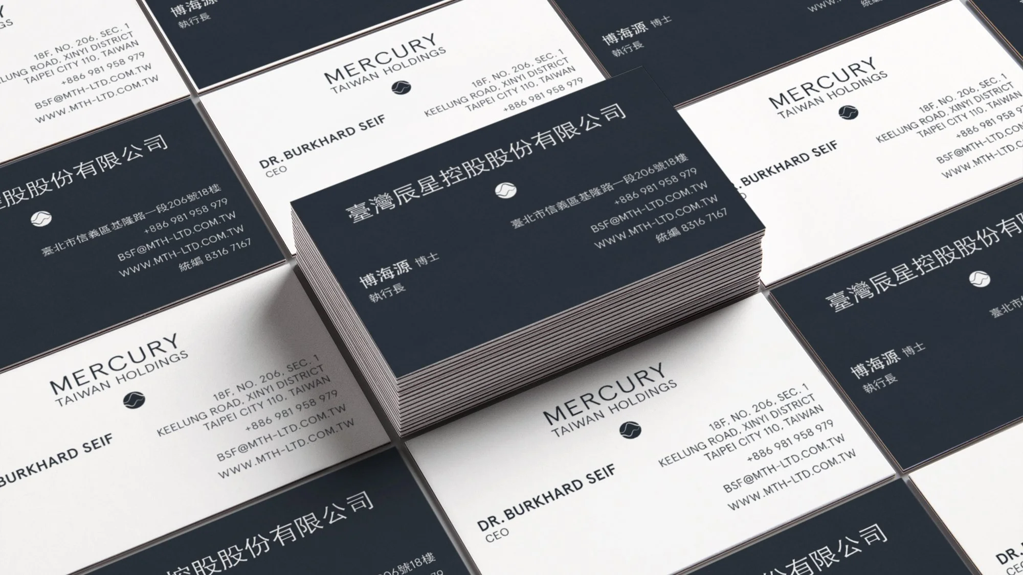
Business Cards


The end result was a culturally balanced identity, negating the need for an English or Mandarin-first approach. This meant the client could have the flexibility to use a one-size fits all solution across all their marketing communications.
We provided MTH with a full brand kit (guidelines, stationery and social content templates) as well as powerpoint decks and a website.
Mandarin versions are in the pipeline - watch this space!
“Our identity spoke perfectly to our audience - visually engaging and hitting the right tone. The marketing assets provided were easy to use and implement”


Landing Pages

Landing Pages
Landing Pages

Landing Pages

Landing Pages
Landing Pages
Fancy a brand strategy health check? Get in touch…